Feature
Research Report
Building the Case for Modern Public Sector Messaging


The rise of mobile-first ecommerce (also called m-commerce) reflects a fundamental shift in consumer behavior, as more people routinely reach for their smartphones to shop online. A 2023 Statista report revealed that m-commerce sales reached $2.2 trillion in 2023 and were attributed to 60% of global ecommerce sales. This trend requires that online retailers prioritize mobile-first design and functionality to ensure a seamless customer experience. A mobile-first approach means websites and apps are designed for the smallest screen first and then scaled up to larger screens, rather than the other way around. This article will examine the reasons why brands are prioritizing mobile design for apps, websites and near-me searches, and the challenges that mobile-first entails.

Shaunak Amin, co-founder and CEO at SwagMagic, a global corporate swag platform, told CMSWire that last year the company revamped its platform by optimizing the user interface for smartphones and tablets. "As a result, we saw a remarkable 30% increase in user engagement within the first three months post-implementation,” said Amin. An effective mobile-first design can also substantially improve a brand’s Customer Effort Score (CES). “Our clients reported a 25% decrease in the time taken to select and send gifts. And they said it was all due to the intuitive and responsive mobile interface.” Amin emphasized that customer feedback revealed a 40% rise in overall satisfaction, emphasizing the convenience and fluidity of navigating the platform via mobile devices.
A recent Glassbox survey indicated that 60% of those polled preferred mobile apps over websites for convenience, and as such, 84% would be willing to install and shop through a mobile app if it gave them access to better sales or pricing.
This shift to mobile apps is not merely about aesthetics; it's about convenience and meeting customers where they are. The majority of consumers tend to prefer using mobile apps over mobile websites for ecommerce largely because they are designed with mobile in mind, and there is no question that they will be ultimately more usable than a typical website via a mobile device.
A 2021 Heady survey indicated that 57.5% of those polled said that mobile apps are more convenient than other shopping mediums. Additionally, the survey revealed that consumers overwhelmingly use apps with the intent to shop and purchase, with 74% of respondents stating that was the most-used feature. According to an October 2023 Statista survey, in the most recent quarter, global consumer spending on mobile apps was $33.9 billion, a number which was up 4% compared to the same quarter in 2022.
Additionally, in 2022, the total amount spent on mobile apps was approximately $387 billion, more than double the pre-pandemic 2019 spending. The Statista survey also revealed that nearly one-third of U.S. consumers purchased something online using a mobile phone weekly as of late 2022.
Related Article: Creating a Mobile-First Mindset
Back in the late 1990s, most cell phones had limited web surfing capabilities, but as the technology of the early 2000s improved, people began to get used to browsing the web on their phones. As technology continued to evolve and smartphones came into the picture, the prevalence of internet-capable phones exponentially increased. Consumers got used to using a phone to visit a website, only to have to turn their phone to a landscape perspective to be able to view the website. Enlarging the view to be able to read the content was also something that people got used to doing, albeit with a growing sense of frustration.
Finally, developers began to create a responsive version of their websites by adding functionality that enabled the site to detect if the viewer was using a desktop computer or a mobile device. Once detected, it would display the appropriately designed site. Finally, mobile design became a priority, rather than a second thought, mobile-first design was born, and consumers have never looked back.
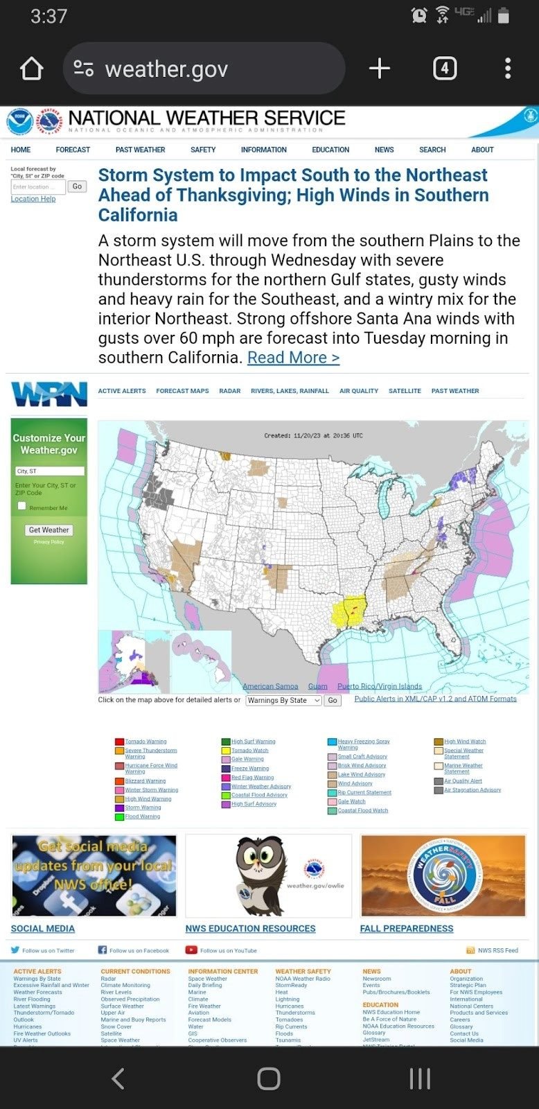
That doesn’t mean that today’s websites are all designed with mobile viewing in mind. On the contrary, there are still many websites, including some brands that should know better, that do not have a mobile-first website. Their sites are difficult and cumbersome to use, though still functional, and many consumers simply will not even attempt to use such archaic websites. Weather.gov, for example, should know better, after all, it’s a site that people would want to be able to access no matter where they are. Unfortunately, it doesn't seem to have considered that in its design.
As mobile usage continued to outpace desktop, search engines such as Google made mobile-friendliness a key ranking factor, incentivizing businesses to adopt a mobile-first philosophy. Since 2020, Google's mobile-first indexing has underscored the importance of mobile optimization for search visibility. Ecommerce businesses invested in responsive design, resulting in faster page load times, and simplified navigation to cater to the mobile shopper. These enhancements benefited not just the user experience but also contributed to higher conversion rates and customer retention.
Justin Ball, founder and owner of HammerHead Showers, an all-metal showerheads and accessories retailer, told CMSWire that even for a product niche such as shower heads, consumers overwhelmingly shop via their mobile devices. "Prioritizing for [the channels] where our customers shop is one way we improve the customer experience,” said Ball. “Additionally, Google uses mobile-first indexing, meaning that if your mobile site isn't optimized, then you will not rank high in search. One important thing we did early on was optimizing our images for mobile. Additionally, we use fonts that are easier to read on a mobile device rather than allowing for our desktop site to simply get squeezed to fit.” Ball explained that by making the site responsive, they were able to achieve a clean look on mobile.
With improved mobile payment options and social commerce, the purchasing journey on mobile devices has become more intuitive and integrated into daily social media use, driving further adoption. Mobile-first design has become a critical component of website development, reflecting the importance of delivering content effectively to the majority of internet users who now access the web via mobile devices. This approach ensures that the user experience is optimized for smaller screens, which can lead to increased engagement, lower bounce rates and higher conversion rates.
Consequently, a website designed with a mobile-first mindset is more likely to perform much better in search engine results, driving organic traffic. Beyond SEO, mobile-first design is about respecting the user's time and context, providing a fast, responsive, and intuitive experience that meets the high expectations of today's users. Failing to implement a mobile-first approach can result in a competitive disadvantage, as consumers increasingly favor businesses that offer a superior mobile experience.
Craig Greiwe, chief strategy officer and president of marketing at GoDigital Media Group, a media technology company focused on intellectual property rights management and distribution, told CMSWire that mobile-first has been an important command for almost a decade now, and ecommerce is no different. "However, the back-end platforms many businesses use have been slow to adapt. Most importantly, and still up in the air, are two questions: first, how to give the customer a positive, descriptive experience with the product that makes them want to buy, and second, how to minimize the number of steps at checkout."
Greiwe explained that on mobile devices, providing the same level of detail that customers receive on desktops can be challenging. "The scroll depth question is a big issue, as is the size of the device. For the latter, absent single-click payment systems like Apply Pay, there continue to be just too many steps to get a customer from product to completed purchase."
Related Article: A How-to Guide for Local Marketing
Businesses should prioritize mobile-first development for "near me" searches primarily because these searches are predominantly performed on mobile devices by users on the go. When users search for services or products "near me," they are often looking for quick, immediate solutions and are likely to act on the information they find. A mobile-first approach ensures that these potential customers are presented with a website that loads quickly, is easy to navigate on a smaller screen, and provides the essential information upfront, such as business hours, location, contact information and services offered.
Additionally, search engines like Google place a high emphasis on local SEO and mobile usability when ranking search results for "near me" queries. Websites optimized for mobile will rank higher, making them more visible to potential local customers. This optimization includes responsive design, quick load times, localized content, and easy access to click-to-call buttons or maps, all of which are critical for capturing the business of local searchers. In essence, the mobile-first strategy for "near me" searches is about capturing the attention of local, ready-to-act customers by providing them with a frictionless online experience.
Gene Caballero, co-founder and CMO of GreenPal, a “lawn care near me” service, told CMSWire that prioritizing a mobile-first approach in ecommerce is not just an option but a necessity, especially considering the evolving consumer behaviors. “At GreenPal, understanding this shift was critical, as landscaping professionals extensively use mobile devices for their business operations. To leverage this trend, we focused on optimizing our platform for mobile users,” said Caballero. “This meant ensuring that our website and app weren’t just responsive, but also offered a seamless, intuitive experience on smaller screens. Key best practices we adopted included streamlining the user journey for easy navigation and transaction completion on mobile devices.”
Caballero said that a significant part of this process involved simplifying interfaces and enhancing the speed of their mobile applications. “We also placed a strong emphasis on mobile-specific features such as push notifications and easy-to-use booking systems, which are particularly beneficial for our users who are often on the go. This mobile-first strategy has effectively boosted user engagement and satisfaction, crucially contributing to GreenPal’s growth and market presence.”
Related Article: CMSWire's Top 10 Ecommerce Articles of the Year
Creating a mobile-first website is not always a straightforward process, although fortunately, the majority of website Content Management System (CMS) themes or styles automatically include mobile-first design. That said, there are still many obstacles that can present themselves in the process of mobile-first development, including:
As mobile devices become the predominant mode for online activities, adopting a mobile-first approach in ecommerce has evolved from a recommendation to an imperative. Prioritizing the mobile experience offers invaluable benefits — enhancing engagement, streamlining user journeys, boosting conversions, cementing brand visibility and ultimately delighting always-on customers. Brands that embrace mobile-centricity give themselves an edge in engaging today's consumers.