Imagine Facebook without selfies, Instagram without videos or Amazon without product images. You can’t, can you? In this digital-first world we live in, data overload is a menacing reality, and a picture is not just “worth a thousand words” … it is priceless.
The right visual element can attract our attention, make complex concepts clearer and assist in our decision making process.
Here are three important business tasks where I think the right visuals make all the difference.
Bringing Big Data to Life
As big data becomes increasingly important to how we do business and serve our customers, the science of visualizing information has also become elevated. This is not a new notion. Edward R. Tufte, a statistician and professor emeritus at Yale University is a pioneer in the discipline. His landmark 1983 book, "The Visual Display of Quantitative Information," provides guidance on successful information design and visualization. Tufte gave us six fundamental principles of analytical design that are timeless and translate from paper to the digital world:
Show comparisons, contrasts, differences.
Show causality, mechanism, explanation, systematic structure.
Show multivariate data; that is, show more than 1 or 2 variables.
Thoroughly describe the evidence. Provide a detailed title, indicate the authors and sponsors, document the data sources, show complete measurement scales, point out relevant issues.
Analytical presentations ultimately stand or fall depending on the quality, relevance and integrity of their content.
Tufte also gave us a cool vocabulary for recognizing and discussing bad design: terms like chartjunk (interior graphic decoration that generates a lot of ink but does not tell the viewer anything new) and lie factor (numbers physically appearing on the surface of the graphic that are not directly proportional to the quantities represented).
Tufte’s innovative ideas like sparklines are used to this day as a condensed and elegant way to present trends and variation embedded directly in text. For example: The Dow Jones index for February 7, 2006
As a graphic visual representation of knowledge that presents complex data quickly and clearly, an infographic can enhance understanding by improving our ability to see information patterns and trends. While infographics are a current popular embodiment of Tufte’s principles of analytic design, they have an interesting history of their own that includes, but also predates his work.
A famous infographic milestone occurred in 1857 when English nurse Florence Nightingale used information graphics to persuade Queen Victoria to improve conditions in military hospitals. She used a Coxcomb chart, a combination of stacked bar and pie charts, depicting the number and causes of deaths during each month of the Crimean War. Once you see the chart, the picture makes it clear that the Russians were a minor enemy: the real enemies were cholera, typhus and dysentery.
Another big step in the story of infographics was taken in 1931, when Harry Beck created the first map of the London Tube showing only lines to depict public transit routes and stations. This was an important development, because it moved visual diagrams into everyday life.
Over the past several years infographics have taken off and their use by marketers is closing in on a saturation point. However, when done well, they remain an extremely useful means of visualization. As the Best Infographics of 2014 (so far) points out, “Humans have short attention spans and, let's face it, the internet is cluttered. To stand out, boost engagement, and increase shareability, many marketers have turned to visual content -- especially infographics.”
Tufte declared that “the purpose of an evidence presentation is to assist thinking.” In 2003 he shared his thoughts on the now omnipresent business presentation tool in his article, PowerPoint is Evil. His conclusion blames the person rather than the technology:
PowerPoint is a competent slide manager and projector. But rather than supplementing a presentation, it has become a substitute for it. Such misuse ignores the most important rule of speaking: Respect your audience.”
Swedish physician and statistician Hans Rosling offers a more positive view of presentation technology and presenter style. His 2006 TED talk, “The best stats you’ve ever seen,” debunked myths about the so-called “developing world” and has been viewed by millions. Rosling transformed dry statistics into an illuminating form of entertainment, earning him a spot on Time magazine's 2012 100 most influential people list. The talk used animated graphics created with Gapminder Foundation's Trendalyzer software.
Animated scatterplots had been done before. But the way Hans Rosling used them to show data and make it interesting was an eye-opener for the visualization community. Who knew that you could use visualization not just to analyze data, but to present it and make it interesting? This wouldn't have worked without Rosling's performance, but that only worked because he had impressive charts to work with.
CEO of Duarte Design, graphic designer and writer Nancy Duarte (@NancyDuarte) is well known for her best-selling books, including "slide:ology: The Art and Science of Creating Great Presentations." (In the interests of full disclosure, Duarte is one of my idols, not just for what she does, but also because she shares my experience as an undergrad Mathematics major.) In her article Stop Underestimating Presentation Software, Duarte points out that presentation software -- when used properly -- can indeed be an effective tool:
Many of us know intuitively that visuals increase our understanding of concepts, but one study showed that people who follow directions that have both text and illustrations do 323 percent better than people following text-only directions. Much of that may have to do with the fact that we can understand an image in just 13 milliseconds. Regardless, it’s clear that including visuals with your text will help you get your message across. Presentation software is by far the easiest tool to use to do this.”
Duarte and her team have extensively studied presentation structures to see what makes the best ones tick. Their VisualStory™ methodology is “designed to shape ideas into presentations that shift audience beliefs and behavior.” “If people can see what you’re saying, they’ll understand it. Use visual thinking and smart design to conceptualize your ideas and convey information clearly and powerfully.”
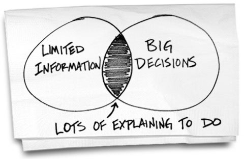
Dan Roam (@dan_roam ) tells us that everyone is born with a talent for visual thinking, even those who swear they can’t draw. In "The Back of the Napkin," one of my favorite business books, he shares a practical framework and visualization techniques along with proof points that illustrate how any problem can be made clearer with a picture. Roam's Look–See-Imagine-Show approach has been used by enterprises from diverse sectors to solve complex problems, including Walmart, Wells Fargo, the United States Navy and General Electric.
I am a visual thinker and find myself turning to Roam's method, especially the six ways of seeing and six ways of showing construct that is based in the science of visual thinking. And while I don’t necessarily recommend this particular approach, I have a great story about a bar in Amsterdam where we literally planned out a product launch on the back of a cocktail napkin.
At the end of the day, drawing by hand -- on a whiteboard, a tablet or yes, the back of a napkin -- is not only a great way to encourage collaboration, it makes both the “presenter” and the “audience” actively engage in the discussion.
Improving the Customer Experience
When we think about using pictures to actively engage customers, the element of visualization in creating engaging omnichannel experiences probably comes top of mind. I’ve written before about customer experience management and the importance of getting omnichannel right. But visuals are also critical to what lies beneath the customer experience. Case in point, journey maps.
A customer journey map is a very simple idea: a diagram that illustrates the steps your customer(s) go through in engaging with your company, whether it be a product, an online experience, retail experience, or a service, or any combination. The more touchpoints you have, the more complicated -- but necessary -- such a map becomes. Sometimes customer journey maps are 'cradle to grave,' looking at the entire arc of engagement.”
As Bernhard Schindlholzer writes, “Customer journeys provide new insights into consumers by incorporating an emotional as well as time-based dimension of consumer behavior.”
This emotional element may be why Forrester Research has identified journey mapping as key to customer centric digital transformation. In his report, “Journey Mapping Best Practices,” Forrester’s Tony Costa (@tonyjcosta) points out that “Journey maps function as a lens through which employees view their company from the perspective of the customer, cutting through organizational silos and structures.”
Forrester’s Deanna Laufer (@deannalaufer) wrote about the power of journey maps in her blog saying “all of a sudden, you see the light bulb go on for the participants. It can be the realization that their customer has to jump through an inordinate number of hoops to submit a simple service request or have to wait five to 10 days for repair ... or when the workshop participants realize they have no idea what their customers are doing or thinking, but maybe they should.”
Journey maps force a change in thinking and even a remaking of organizations in terms of the customer experiences delivered. Because of this, journey maps can become the new executive dashboard. As Forrester shares, “the customer-first nature of journey maps make them a natural fit as dashboards for monitoring a company’s performance. Generic dashboards and scorecards will be replaced by instrumented journey maps that update in real time.”
Thinking with Pictures
I considered submitting a series of pictures for this article, without text. Then I realized that just as words and music must come together to create a great song, the artful (and scientific) combination of words and pictures is the way to create great concepts and energize people to take action.
And, by the way, our product launch on a cocktail napkin went just fine, thank you.
Deb Miller has led marketing initiatives at global companies like GE, Software AG, Global 360, OpenText, and Appian. Her work focuses on industry strategies for enterprise information management and business process improvement.