Editorial
On-Demand Webinar
Do More with Less: Modernizing the Cloud Contact Center

With data being so widely used in organizations, it is vital to plan the systems that rely on that data. To do that you need a visualization that lets your marketing teams see your diagrams and easily make corrections as systems inevitably change.
One of the most interesting visual documentation is Mermaid.js, a JavaScript graphing framework designed to allow users to create diagrams. Marketers can use this framework to form illustrations of systems that support their marketing operations, leading to faster support decisions.
Marketers are increasingly turning to solutions that bridge the gap between programming syntax to complete a task and capabilities that remain simple to use.
Mermaid.js flowcharts serve as quick diagrams for a high-level system architecture. They are designed to embed easily in markdown documents. Markdown documents are visuals usually created for programming projects — the documents usually are reports that outline the code of a programming project.
The documents are usually exported as pdfs, HTML or Word documents. Some markdown features do not have the full visual polish for a presentation so some aspects may not have the visual pizzazz of a media-rich document. But Mermaid visuals are meant to appear alongside programming code so other team members can better visualize a data process. Mermaid offers features that are simple to update and better envision processes for managers.
Related Article: A Marketer's Guide to the Best Text-to-Image Generators
Marketers can create diagrams through the Mermaid Live Editor, a cloud-based application that shows the visuals alongside the code. The Live Editor is convenient for developing a preview of a graph, letting you see how your diagram choices appear and make adjustments. Think of it as the graph creator equivalent of Google Looker.
Users can make adjustments to the graphs within the Live Editor such as adding labels to objects and paths. Mermaid.js does permit customized shapes. Some common shapes are premade as a template, such as a database shape. It is created using the [(Name)] syntax. Changed graphs appear in real time in the Live Editor.
The first step is declaring a diagram choice. Mermaid offers several diagram types to begin a visualization. Mermaid offers basic graphs, such as a pie chart and an X-Y chart for line and bar graphs. There are ones you will likely see in a business setting, such as mind maps, Gantt charts and a timeline.
Finally, there are process flow diagrams such as Sandkeys for the moments when you need to describe elements of a process and how they fit together. There are also specialty diagrams like block diagrams used for software development and network systems.
The following are five ways to get started with Mermaid.
A flowchart is a pretty basic graph to represent a planned system. To use it you must declare the word “flowchart” in the editor, then provide the nodes in a sequence on each line. In a simple example, you would indicate from node A to B, then B to C on the next line. The syntax in this example is A – – > B, then B – – > C on the next line.
You can create more than one connection between nodes i.e. A – – > B, then A – – > C .
The next step involves adding detail to the flowchart. You can shape each node with a bracketed word. This is useful for adding text and inserting specialty shapes like a decision diamond. You can also label the connection line as well, to indicate what is being passed to each node.
Here is a simple example and its code:
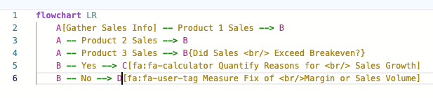
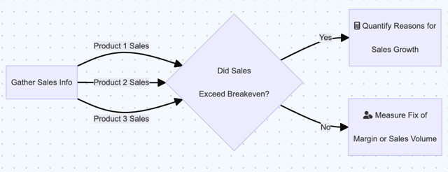
The example displays a simplified flow. The process gathers some sales information and making a decision on products sales that meet a breakeven value. Each arrow is labeled with what is being passed to the decision diamond — sales on the left side, a yes or no decision on the right.
Related Article: Microsoft's Integration of Python in Excel Revolutionizes Data Analytics
Mindmaps are a great way to show how varied resources can pinpoint
I create this mindmap based on the “root” — the central element in the map. Each element near the root are considered part of a first level branch. The elements branched from the first level elements are considered a second level element, and so forth.
Here is what the mindmap syntax looks like:
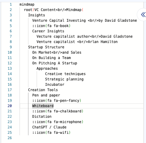
In the image I am showing a mindmap for preparing content related to venture capital. The root is the cloud bubble — VC Content Mindmap. The first level elements are Insights, Creation Tools and Startup Structure. The elements around each of those are second-level.
Here is the resulting mindmap:
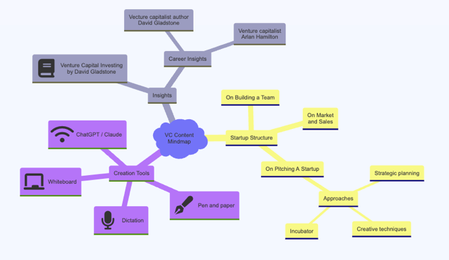
In the content creation tools, I added icons. These are available through Font Awesome. Icon are symbols that jazz up the diagram. To add icons, you search on the site of an open-source icon provider i.e. Font Awesome for the icon name. You then type on a line under your element the icon shape you specify using a unique prefix “::icon (fa: fa-iconname). The graph imports the icon image. It appears as you add the syntax in real-time.
The purpose behind timelines, let alone the definition, is pretty straightforward — according to Wikipedia, timelines “illustrate a chronology of events, dates, or periods of time.” If your marketing teams deal with retail sales or with social media, then they deal with sales periods that must be highlighted.
To make a timeline, marketers can select the Timeline template. The syntax features blocks where periods and associated descriptions can be added.
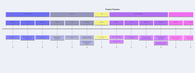
A timeline graph is also a great way to capture updates on a framework used in software development. Let’s say your team needs an overview of feature details for Meta’s LLama AI — a timeline can capture the story of its launches and feature additions, giving a quick overview of highlights rather than technical documents that can take a bit of effort to draw a few insights.
Related Article: Excel, SQL, Python: What's Your Data Flavor for Customer Experience?
This diagram is useful for understanding data and metadata. An entity relationship displays the connection between one entity versus another. Many times these entities have details that are often captured by nested data. If it sounds suspiciously like schema for SQL, you have the right idea. A schema is about describing a database. In this case, however, the focus is on entities that end up in a data program or storage.
Take for example a customer's purchase of two products. The entities are each part of a purchase — a customer, the placed order, and the products being requested in the order. There are labels to describe an action or association between entities — a customer places an order and an order contains line items.
Here is what the syntax and the resulting graph looks like:
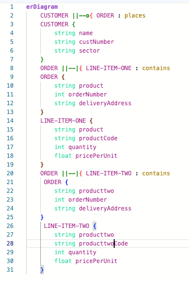
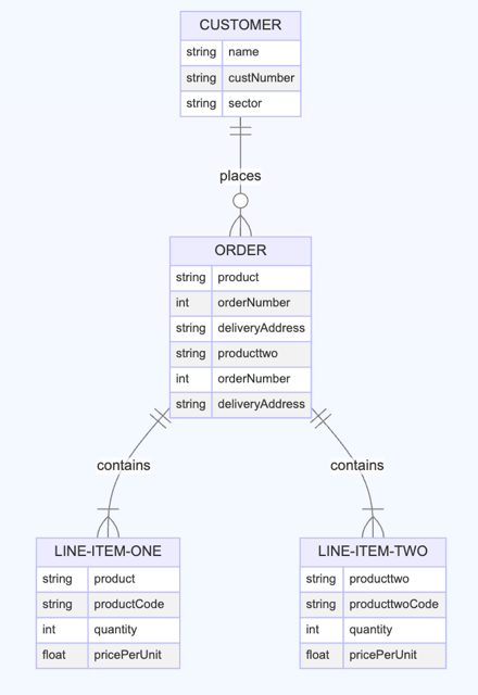
The entity-relationship also shows the associated metadata and what format (string or integer) the metadata takes. All of this can help highlight what kind of information is anticipated and think of how the information is captured within a given system or environment.
A user journey has a similar structure to a timeline graph. But in this instance, the graph maps how users of a given system interact with each element of the system. This kind of map can outline what the expected operations are involved over time.
Mermaid can do more than the examples shown. Unlike most online applications, you have options available to try it in a number of venues. Beyond the Live Editor, there are extensions in many integrated developer environments (IDE) that allow users to create a Mermaid diagram alongside programming code, and then save the program and diagram in a shared document. This can help foster discussions about a process being described in a Mermaid graph.
To learn more about how to leverage Mermaid, you can read the Mermaid documentation page. It lists all the types of charts you can create with Mermaid and their associated syntax, as well as other options such as video tutorials to help your workflow. Each basic chart type is displayed as a template, inspiring ideas for what you want to display.
Mermaid is one great choice among those solutions. If you are one of those marketers, keep your eyes open for other solutions that can complement solutions like Mermaid and make your workflow easier.
 Learn how you can join our contributor community.
Pierre DeBois is the founder and CEO of Zimana, an analytics services firm that helps organizations achieve improvements in marketing, website development, and business operations. Zimana has provided analysis services using Google Analytics, R Programming, Python, JavaScript and other technologies where data and metrics abide. Connect with Pierre DeBois: 
