Editorial
Research Report
The 2026 State of CX Outsourcing

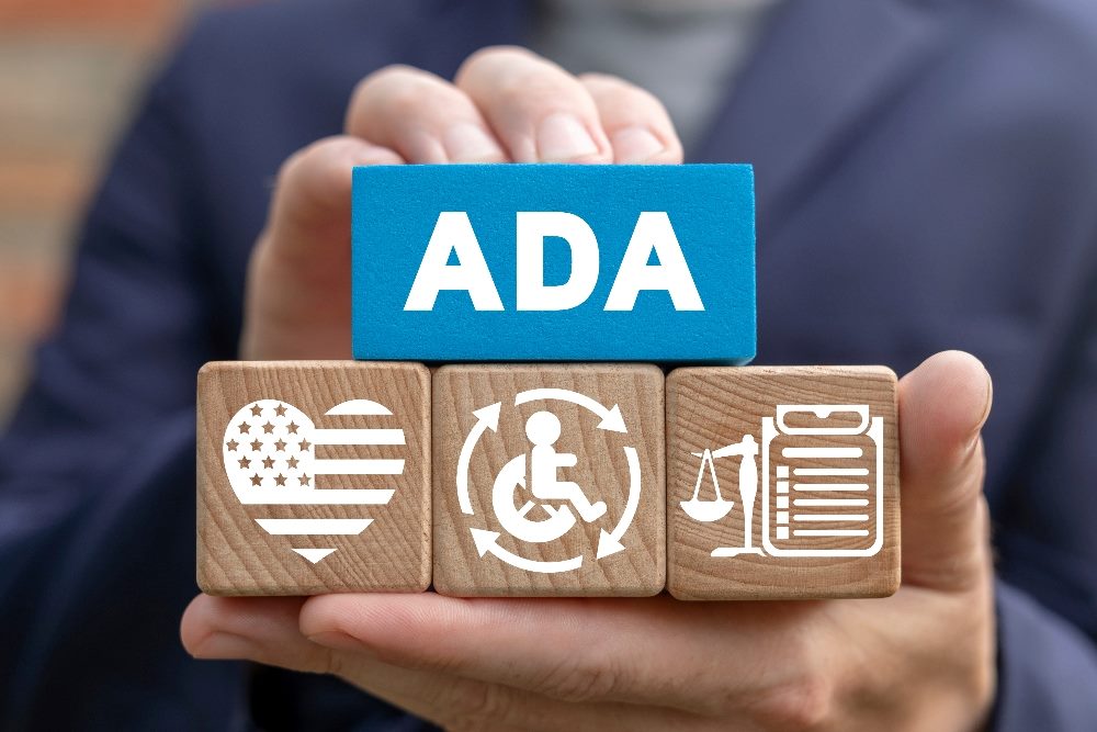
Worldwide, at least 1.3 billion people live with a disability and 2.5 billion need assistive technologies in daily life. Laws including the Americans with Disabilities Act (ADA) and European Accessibility Act (EAA) are supposed to ensure that everyone, irrespective of ability, can navigate physical spaces and participate in public life. Yet these laws have not kept up with the digital experiences where work, education, healthcare, relationships and civic life increasingly happen.
Let's take a look at accessible web design.
WebAIM, an accessibility nonprofit, reports that 96.3% of the world’s most popular 1 million homepages fail to meet the Web Content Accessibility Guidelines (WCAG) 2, the industry gold standard. In other words, just 3.7% of these websites adequately serve people with disabilities who, by the way, represent $1.3 trillion in disposable income. If another group was so thoroughly excluded from the web, there’d be outrage — and the lawsuits would be front-page news.
As we’ll illustrate, accessible web design improves the web for everyone, not just people with disabilities. Why wouldn’t brands adopt accessibility practices that enable at least another billion individuals to discover and buy their products without any downsides?
Those of us who work in marketing, digital experience and design have both a moral, legal and business responsibility to make our work accessible. The question is how. We believe that by adhering to basic principles for content design, distribution and testing, brands can make progress quickly.
Content, as we define it, is all the information we encounter on the web, whether it’s visual, textual, audio, tactile, interactive or otherwise. Generally, WCAG considers a web experience accessible if it is perceivable, operable, understandable and robust (POUR) for people with a wide range of abilities.
While there are other frameworks and principles to consider, we’d be violating POUR if we made this overly complicated. So, what does it mean to apply POUR in marketing and digital experience? We’ll use everyday scenarios to illustrate.
Related Article: Web Accessibility and What Brands Need to Know: Q&A With Steve Barnes
In marketing emails, the “Unsubscribe” or “Manage Email Preferences” link tends to be as imperceivable as possible. Tiny text, low contrast and light colors are used to deemphasize it and thereby reduce unsubscribes.
For visually impaired people who don’t necessarily use a screen reader but struggle with color blindness or far-sightedness, camouflaged unsubscribe links are frustrating and hurt trust in your brand. For blind people relying on screen readers, finding the button might take a while, especially if they have to sift through a barrage of visual elements, other links and text first.
Then comes the gauntlet of confusing questions and checkboxes. Am I opting in or out? Weird phrasing adds frustration and confusion, especially for neurodivergent audiences. Plus, the requirement to log in first or enter an email address adds more friction for anyone who struggles with typing or relies on speech recognition technology. A lot of email addresses don’t exactly roll off the tongue.
Inaccessibility isn’t a solution to email churn — better content is. Similarly, hiding the links to live customer support isn’t a solution to contact center costs — better products and automatable support policies are. Permitting inaccessibility to reduce costs or boost marketing metrics is wrong.
Related Article: Why Analytics, Accessibility Are Essential for Designing Digital Customer Experiences
Marketers typically think of hardware as an issue for IT and engineering teams. But people who want to operate a marketing-related experience — like trying on sunglasses in augmented reality or using a custom product builder — might not be able to use a mouse.
Those individuals rely on keyboard commands or speech recognition. But commands often require people to click or hold two or more keys at once, sometimes in combinations that require two hands. That’s hardly accessible.
Why not have the arrow keys switch between sunglass styles or options on the custom product builder? Why not display one-click key and voice commands for every user, with alt text descriptions, so the options are clear? To be operable, a marketing experience must enable everyone to use and navigate it. Marketers may not engineer these experiences, but they can set more inclusive standards for operability when communicating their requirements to IT teams.
Related Article: Designing Diversity, Inclusion and Accessibility Into Web3
Buttons labeled “Start,” “Subscribe,” “Register,” or “Download” lean on visual elements and context to tell people what’ll happen if they click. What they’re saying OK to, signing up for, registering for or downloading may be unclear, especially to people who use screen readers.
Consider a visually impaired person who must wait on their screen reader to describe cluttered, complex user interface (UI) elements and read blocks of long text before the button’s meaning is clear. Using few words makes the button appear clean and elegant at the expense of comprehension. There is such a thing as being too concise.
Try more description buttons, like “Start a new session,” “Subscribe to our newsletter,” “Register for a free trial,” or “Download Our 2024 Sustainability Report.” Not only blind people but those who experience dyslexia, ADHD or other forms of neurodivergence will feel more confident navigating your site with accessible web design.
Suppose the launch campaign for a new product, a robotic self-driving vacuum cleaner, is based entirely on videos. The team wants audiences to see the product in action, sense the contentment users feel and grasp the value proposition through the words of a narrator.
For distribution, the team posts the video on YouTube and embeds it on multiple marketing channels. YouTube provides a transcription automatically. Still, people with disabilities — prime buyers for an assistive cleaning device — might not be able to interpret the video reliably, which means it’s not robust.
The YouTube auto-transcription captures speech but doesn’t describe scenes and images, meaning the value proposition and emotions aren’t clear to visually impaired audiences. Moreover, a neurodivergent viewer who prioritizes functionality and data rather than emotions may not take away a consistent message either.
Just as brands cater to different personas and personality types, they need to accommodate different abilities. This team could make custom transcriptions for blind individuals or, better yet, craft the script to make the audio as informative as the visuals. Likewise, highly-quality transcriptions or text overlays capturing the narrator’s words could help hearing impaired audiences.
For the most important campaigns, offer a diversity of content and hire creators with disabilities who know best how to serve their peers. A robust campaign doesn’t have to give everyone everything in just one piece of content.
This is far from a comprehensive guide to accessible web design. Rather, this is a call to action and effort to raise awareness of accessibility and how it surfaces in marketing.
Brands need their own guidelines for what accessibility means in the context of their products, services and digital experience. Most importantly, they need checklist workflows to ensure that no experience goes live without meeting these guidelines.
To start, have your content reviewers install the WAVE browser extension and run it before approving any webpage to go live. It will flag the most critical WCAG failings. For web and application development teams, Axe catches accessibility issues as they code rather than later, when do-overs cost more. Google’s Lighthouse accessibility audit tool is good for scoring your accessibility levels on a weekly or monthly basis. Always use at least two tools to gauge accessibility (i.e., “triangulate”).
Lastly, we recommend tagging accessibility traits to assets in your content library or digital asset management (DAM) system. That way, when marketers, salespeople, dealers, advertising agencies and others look for content, they can filter to options that cover all abilities.
Some 1.3 billion people are counting on us to include them in the marvels of digital experience. Let’s own that responsibility.
 Learn how you can join our contributor community.
Jake Athey leads Acquia’s go-to-market motion for its digital asset management (DAM) and product information management (PIM) solutions. An expert on DAM and PIM, Jake is responsible for evangelizing the solutions and their ability to fuel productive digital customer experiences. Connect with Jake Athey: 

Mary has been an inclusive design advocate specializing in the Digital Asset Management software for the last 8 years. She has a background in graphic and web design with an emphasis in development. Connect with Mary Blabaum: