Editorial
Research Report
Building the Case for Modern Public Sector Messaging


Researchers believe storytelling developed and became part of our culture before language was fully established.
Storytelling continues to be deeply woven into the fabric of our being today. It’s how we communicate information to our co-workers, friends and family. It drives the film, television and publishing industries. It’s a powerful tool, and essentially how we connect as a species.
Much has been written on the structure and development of good storytelling: opening —> tension —> climax —> resolution. What I find interesting is the application of these techniques within the fields of analytics and visualization.
It appears others do as well, evidenced by the increase in Google search queries for the phrase “data storytelling” over the past several years.

The trouble is, most of the published research and conversation related to data storytelling focuses on data journalism and infographics. And the attention is warranted — some amazing work is being produced by The New York Times, The Washington Post and The Guardian, among others.
But these types of visualizations don’t transfer well to industry, where dashboards and analysis are king.
Fortunately, data visualization expert and author Alberto Cairo recognized this same problem and developed a clear definition of data storytelling comprised of three areas of execution: Annotation, Sequencing and Data Journalism.
We’ve already touched on data journalism, so for the remainder of this article we’ll concentrate on how you can incorporate annotation and sequencing into your data storytelling.
Annotation, by definition, is a note added to a text, book, drawing, etc., as a comment or explanation. When it comes to data storytelling, annotation can be used as a technique to guide the end user through the visualization. This lowers the learning curve for the end user, and allows for greater comprehension of insights. Below are a few methods for annotation that you can easily incorporate into your visualizations:

Sequencing takes data storytelling one step beyond annotation. It builds a narrative by arranging reports in a structured manner to frame the analysis for the end user. The goal could be to convey a particular message or to speed up data consumption through efficient visualizations. Below are three examples of sequencing:
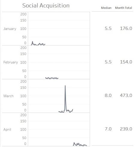
Edward Tufte introduced the concept of sparklines in his seminal book “The Visual Display of Quantitative Information.” Sparklines are small multiples or snapshots of data that easily lend to comparison as evidenced below. They’re built by extracting data into smaller groups for display in high-density graphics that lend a narrative feel.
Another method for sequencing is what I call “mirroring.” This process is performed by aligning visualizations with the customer’s behavior from acquisition through the purchase funnel. It can be highly effective as most everyone in your business will understand the customer journey, at least from a high level.

Visualizing data from various points of view can open your thought process up and begin new conversations that lead to additional insights. Below is a simple example of one metric across multiple views using calculated fields, each telling a slightly different story.

Now this is just one metric. Imagine doing the same across lines of business, product groups or marketing teams with a variety of metrics to answer a vital business question. This can become quite complex, but recognizing and validating these various points of view will allow you to answer questions faster and come to a consensus across the organization.
Storytelling is about connecting with one another. Data storytelling creates that connection by sharing your data, insights and message with your audience. The key to great data storytelling is knowing the message that you want to communicate and arming oneself with the skills and techniques to do so.
 Learn how you can join our contributor community.
Greg is Director, Digital Analytics for MaassMedia, a boutique digital analytics firm based in Philadelphia, and has been with the company since early 2013. He has a knack for bringing creativity to the world of data with his passion for data visualization.