Feature
Research Report
Building the Case for Modern Public Sector Messaging


In February 2017, Google announced it was making Data Studio, which was formerly included in Google Analytics 360 Suite, available for free to any Google Apps user.
After spending the last few months experimenting with Data Studio, I highly recommend leveraging the tool for your reporting needs.
If you already have preferred analytics reporting and presentation tools, why would you make a change? Here are a few reasons why I think a switch to Data Studio is worth it:
Above all, don't forget the price: it's free. You most likely have a Google account already, so you can explore the tool within minutes of visiting the site. It takes about 10 minutes to start your own custom report.
Google offers some light tutorials to get you started, as well as YouTube videos to dive deeper. You may already have analytics reporting tools and haven’t been able to justify configuring a new one, but here is a further breakdown of key features that other free tools can’t offer.
Data Studio’s flexible reporting is driven by its incorporation of multiple analytics sources. Data Studio allows an unlimited amount of these sources which are referred to as Data Sources. The most common integrations are Google Analytics accounts and Search Console.
With Data Studio, you can combine all your data into a single report by pulling SQL data, Google Sheets, Adwords and more. Google Sheets adds a lot of options for any user level. If you are already downloading Facebook analytics data, for example, export the data to a Google Sheet that is now available for report visualization.
With unlimited data sources, you can build reports that combine domains or compare sources. This could consolidate reporting efforts, and potentially reduce the number of tools needed to produce a complete report.
Data sources are great, but an attractive report goes a long way. Data Studio delivers here. I've saved numerous Google Analytics reports and dashboards that I use for client reporting and it takes a long time to export each one and combine them into a single PDF for sharing. I'm also locked into a single design.
With Data Studio I recreated all the dashboard items and custom reports, combining them into a single nine-page report.
This approach saved me hours each month in report creation, while also looking 10 times more professional and tailored to my needs. Google provides some sample templates to start with, and the library should grow in time with user submitted templates. You can also start from scratch. I opted for a hybrid approach by starting with a template and redesigning it to fit my needs.
You can add charts and tables, select the data source(s) with dimensions and metrics, and style them with color and font options, borders and more. The design elements aren't locked to a two or three column grid. Resize anything so suit your needs. Data Studio provides all the design tools you wished for in Google Analytics.
You also have additional time-saving features like creating design themes, setting headers and footers, and selecting elements that will display on every page.
Since Data Studio is baked into Google Apps, it is primed for instant sharing. Your report can become a living document instead of a static file. Sharing options are similar to Google Sheets or Docs where you have a unique shareable link as well as permissions settings.
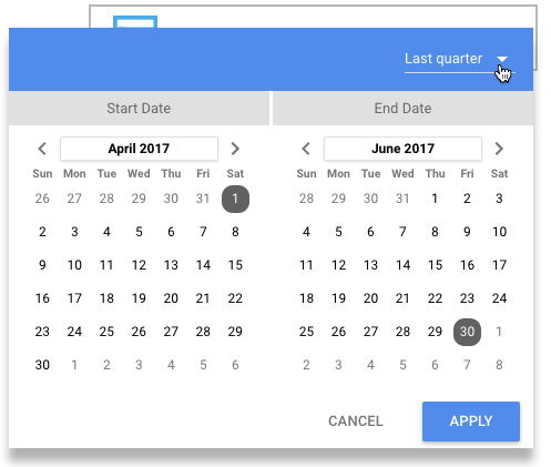
What really makes the report interactive is the ability to embed selection fields in the report. Add a date-picker to your report pages, and when a viewer visits the online report they can adjust the dates to view a different range.
Filters can also be embedded into the page design. This reduces the number of report versions and pages. A report viewer can simply change dates and filters to view the charts and graphs in different ways. When the viewer has more control they can analyze the data without needing to request additional reports. It also encourages of the moment discussions, allowing any team member the ability to dynamically adjust filters and dates for different views.
With an online report, users can also hover on the visual charts to see the data breakdowns. Long tables have scroll bars so your reports can be more concise and visually friendly.


These options aren’t just beneficial to the viewer. The reporter can create a more dynamic presentation by adjusting date ranges to compare results, and apply filters to direct the conversation. Meetings can become workshops and more time can be spent discussing the data in real time and collaborating on decisions.
Data Studio can bring a lot of advantages to your analytics reporting. I personally use it to provide clients with a monthly site health report. Here are a few examples of where Data Studio benefitted me:
Data Studio can raise the aesthetic and professional level of analytics reporting for no cost and a small amount of time. It is still in beta mode and new features are routinely released. If you are using Data Studio or are ready to start, I recommend visiting the forum and feature request sections. You can vote for new features, request your own and track their status.
I wish there were more export options. I love the online interactive and dynamic report view, but some of my clients have strict security rules and sharing a Google link with executives won’t fly. A PDF export option would resolve this, so I voted for it here (vote if you agree!). Until this feature is added, I use an independent add-on that saves the pages to PDF. An integrated export menu would be a great addition to the tool.
One disadvantage you may notice immediately is you can’t import dashboards and reports from Google Analytics into Data Studio. With all of Google’s connected apps, you'd expect an integration between Google Analytics and Data Studio to convert existing reports. Unfortunately, that's not the case, you will have to rebuild them. However, once you’ve recreated your reports in Data Studio with a cohesive and modern appearance, the time saving really begins.
How are you leveraging Data Studio in your practice? Share your feedback in the comments section.
Lindsay Sullivan is a Senior Technical Program Manager at a San Francisco-based web infrastructure company, where she works at the intersection of engineering, product and design. She writes about AI adoption, technical leadership and the human side of shipping software.